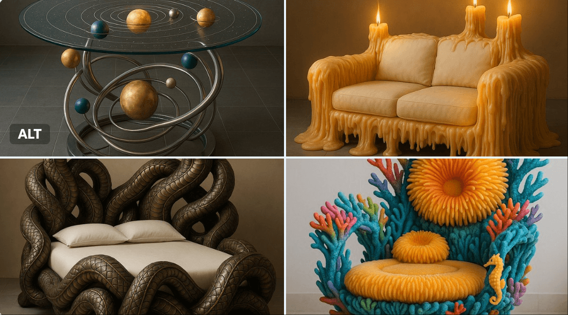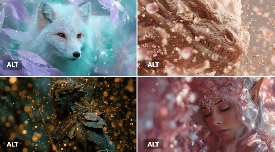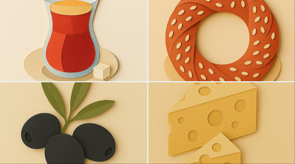
Craft adorable clay-style posters with the Gempix2 and Nano Banana 2 models, perfect for creating top-tier stop-motion animation aesthetics. Ideal for children's brands, event promotions, or social media content needing maximum cute expression. Try keywords like "soft matte clay" and "macro photography" for that authentic handmade diorama feel.
Prompt
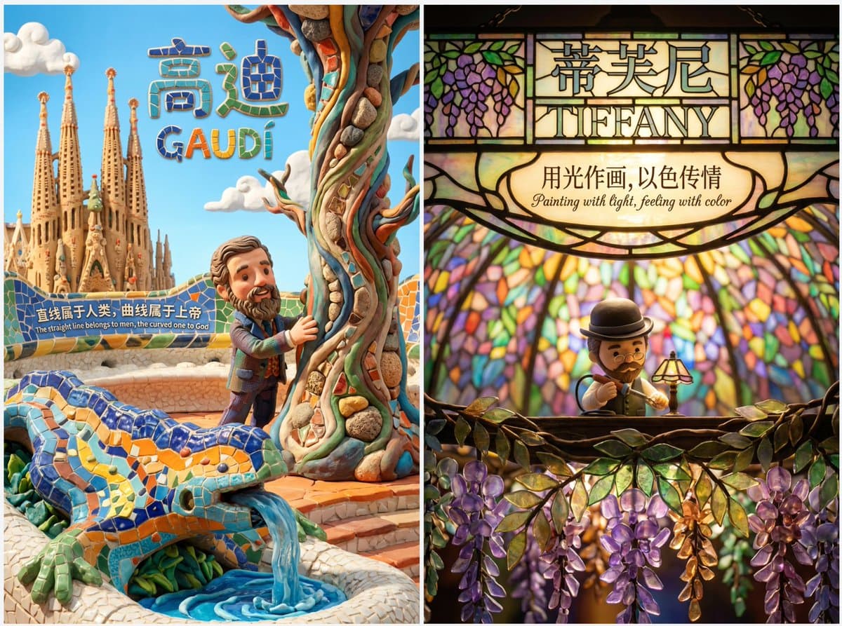
Top-tier clay stop-motion animation style poster for [在此填入核心主题/人物] - MAXIMUM EXPRESSION & IMMERSION
[1. VISUAL STYLE & ATMOSPHERE | 核心画风]
- Style: 3D Clay Art, Q-version cute proportions, Stop-motion Animation aesthetic.
- Texture: Soft matte clay, visible fingerprints, rounded edges, slight imperfections (handmade feel).
- Camera: Macro photography, shallow depth of field (Bokeh), diorama effect.
- Color Palette: [在此填入颜色关键词,如:Soft Pastel, Dark Gothic, Vibrant Neon].
[2. IMMERSIVE COMPOSITION | 沉浸式构图]
- Concept: A seamless 3D micro-world. The character is embedded in the environment, not just standing in front of it.
- Perspective: [在此填入视角,如:Low angle, Top-down, Fish-eye, Isometric].
- Foreground: [在此填入前景物体,用于增加纵深感].
- Mid-ground: Q-version [在此填入人物描述] doing [在此填入动作], surrounded by [在此填入环境元素].
- Background: [在此填入背景元素], blurred for depth.
[3. LIGHTING & MOOD | 光影氛围]
- Lighting Type: [在此填入光效,如:Warm golden hour, Cold moonlight, Dramatic spotlight, Volumetric lighting].
- Shadow: Soft, colored shadows (not pitch black).
[4. INTEGRATED TEXT DESIGN | 文字物理化融合]
- Main Title: "[在此填入中文标题]" and "[在此填入英文标题]".
- Title Style: The text is PHYSICALLY formed by [在此填入标题材质,如:Clouds, Wood, Neon tubes, Stone].
- Body Copy: "[在此填入中文文案]" / "[在此填入英文文案]".
- Copy Placement: Written directly on [在此填入文案载体,如:A floating paper, A wall, A road sign] within the scene.
- Font Style: [在此填入字体风格,如:Handwritten, Graffiti, Elegant calligraphy], natural and textured.
[5. TECH SPECS | 技术参数]
- Resolution: 4K Definition, High Fidelity, Octane Render style.
💡 如何像设计师一样填写?(使用指南)
为了达到最佳效果,请在填写[ ]内容时参考以下“心法”:
1. 构图 (Perspective) - 打破常规
不要只用“平视”。尝试:
Low angle (仰视):表现伟大、压迫感(如贝多芬、诺兰)。
Top-down (俯视):表现掌控、精致感(如韦斯·安德森、莫扎特)。
Inside-out (内部视角):如从后备箱看出去、从山洞看出去。
2. 标题材质 (Title Material) - 脑洞大开
不要让 AI 随便生成字体,指定一种和主题相关的**“物体”**:
写音乐家?标题由**“五线谱”或“乐器零件”**组成。
写赛车手?标题由**“赛道沥青”或“轮胎痕迹”**组成。
写厨师?标题由**“面粉”或“蔬菜切片”**组成。
3. 文案载体 (Copy Placement) - 拒绝字幕
不要让文字悬浮在空中,给它找个**“落脚点”**:
写在飘落的树叶上。
写在斑驳的墙壁上。
写在扔在地上的纸团上。
写在显示器的屏幕里。